
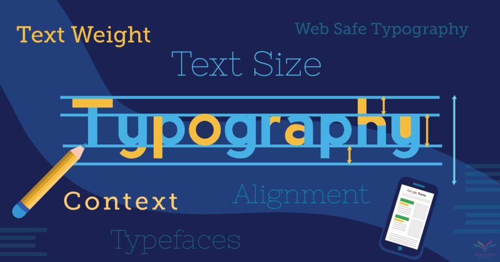
What is typography? Typography is the technique and art of arranging the type or printed characters as a way to make the language visible. It’s a very significant part of website design. Many webmasters think content is king. That is true, but if that content is not presented in a visually appealing manner, it’s a waste of the reader’s time and the webmaster’s efforts. In other words, typography reels in the reader’s attention to the document in addition to the images if present.
Here are some tips on how to improve the typography of your webpage.
Serif or Sans-serif Fonts?
Semi-structural fine details at the ends of some of the strokes which make up letters and symbols are called serifs. Those without these fine details are termed sans serif (from the French word which means without). There are studies done on which of the two are better on a webpage and the results are helpful. Some studies suggest that for offline and on print, it’s better to use serif fonts because they are more readable. For online purposes like webpages, serifs are more difficult to decipher and some studies concluded that san-serifs are cleaner and clearer.
For me, I think san-serif fonts are convincingly better for webpages than serif fonts. Corollary to this are variable-width fonts. They produce the same effect. This is due to the fact that variable-width font letters are placed close to each other and therefore appear more cohesive. On the contrary, fixed-width fonts, in which the letters have fixed spaces in between, appear awkward and rigid.
Bold
Among the three style attributes, bold is the most important. It also stands out the most. The main purpose of a bold style attribute is to attract immediate attention to important and significant parts of a webpage. Secondarily, it can also be used to quickly scan the page and get a gist of the material on hand. In addition, location of information is made easier if one uses bold style attribute
Italics
The primary purpose of italics is to emphasize a particular word or phrase while the reader is reader the text. It’s not used to draw attention. Phrases that are commonly in italics are metaphors, similes, foreign languages, book titles and other phrases of different contexts.
Underline
In a decent webpage, we seldom see underlining. Its main function is also to show emphasis while reading like italics. Additionally, it’s also employed when citing sources in a page. On a side note, underlining is also utilized to show grammatical errors like in MS Word.
The take-home message here is that the use of the appropriate style attribute and font typeface (serif or sans-serif) is dependent on the primary purpose of the content of your webpage or site. Use them judiciously in conveying your message and your readers will stay and continue reading what you have to say. Just like Orlando Pest Control did. You can visit Orlando Pest Control here.